What is the Frontline layer?
The Frontline layer shows the current Ukraine-Russia frontline on the map. It uses regularly updated frontline data, refreshed once a day, and is switched off by default since it depends on a network connection.
How the frontline is displayed
The layer draws two lines:
- Solid green — today's frontline
- Dashed green — yesterday's frontline, used as a reference to measure change
Understanding the arrows
Where the frontline has moved, an arrow marks the change — one icon for a Russian advance, another for a Ukrainian recapture. Each arrow sits inside the actual gained or lost strip of land and points in the real direction of movement.
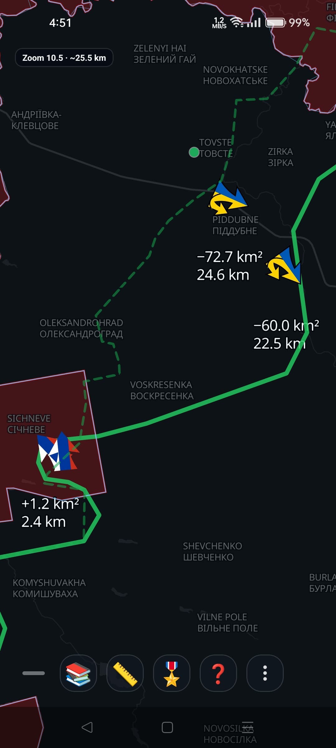
Frontline arrows with change labels, close zoom
Reading the change labels
Next to each arrow, two numbers describe that specific stretch of the frontline — not the whole front:
- Area — the local change for that segment, in km²
- Distance — how far that segment moved, in meters or kilometers
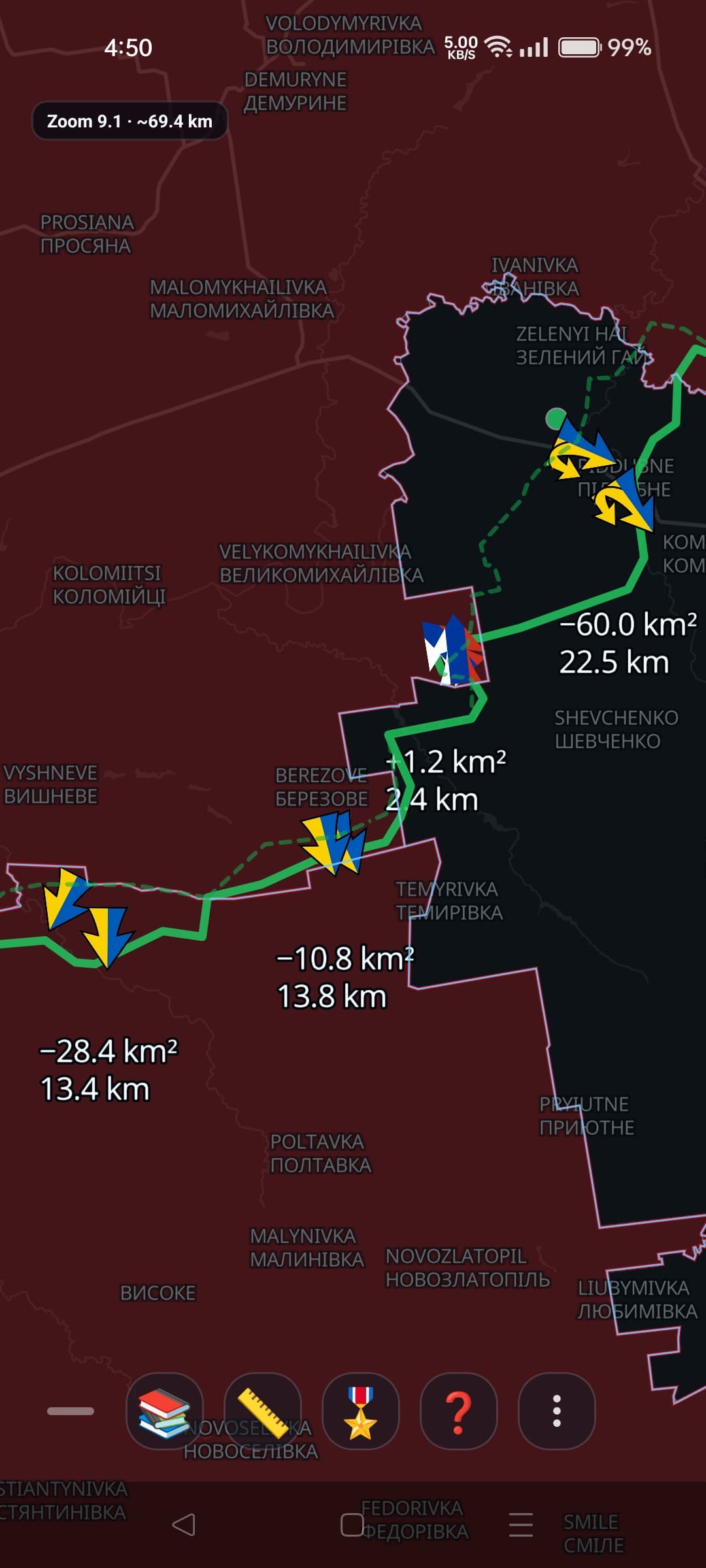
Solid line (today) vs. dashed line (yesterday), wider view
Turning the layer on and off
Open the layer panel from the map toolbar to show or hide the Frontline layer, along with any other layers you want visible.